


Energy Trading Platform
My Role
UX UI | User research | Visual design | Design System
Team
Serena - Product Designer | Product Management Team | Marketing Team
Timeline
June 2025 - On going.............
Project Overview
Redesigned Kazam’s website to improve user experience, mobile accessibility, and brand perception, making EV charging solutions easier to discover.
Kazam
Website Redesign
Work in progress ......
Kazam is an EV charging infrastructure and software company that provides both hardware and software solutions for CPOs, fleet operators, businesses, and EV drivers making charging more accessible, affordable, and scalable.
Problem Identified
Design Process
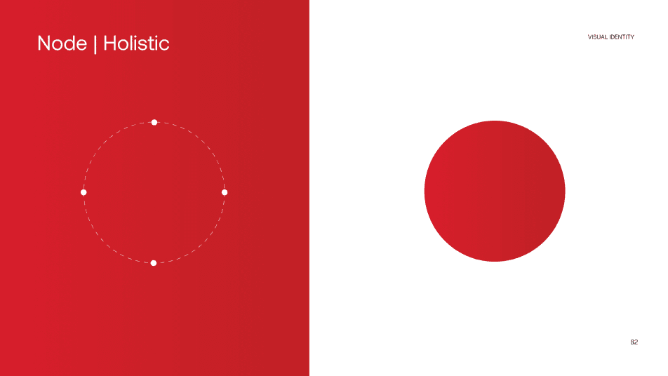
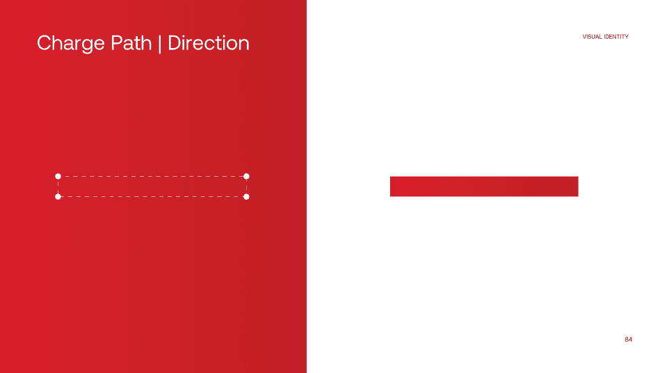
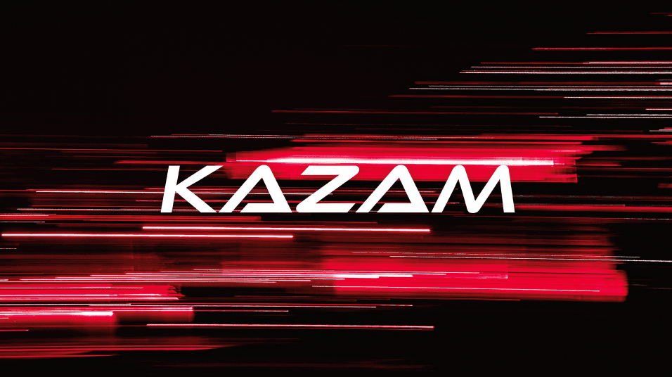
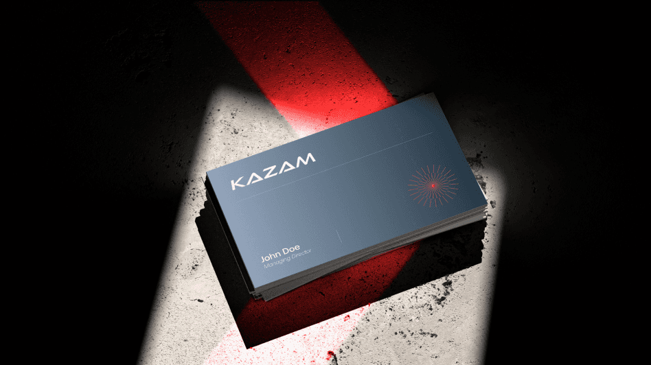
Kazam Brand identity
My collaborators
CTA Color Research
Analyzing User Behavior
Energy Trading Platform
Kazam marketing campaign
Challenges
Concept
Mobile view
Outdated UI
The design feels dated and doesn’t showcase Kazam’s growth.
Weak CTAs
businesses that manage and monetize charging infrastructure.
Information Gaps
Users struggle to access clear and structured information.
Incomplete Pages
Many product and solution pages are left blank or not designed.
1
Product Manager
Coordinated with product managers to align design goals with business objectives.
2
Graphic Design
Collaborated with graphic designers to create visually engaging assets aligned with the brand.
3
Marketing Team
Teamed up with marketing to ensure designs supported campaigns and brand storytelling.
4
Sales Team
Supported the sales team with design solutions that enhanced client engagement and communication.
5
Developer Team
Partnered with developers to transform designs into seamless, functional products.
1
2
3
4
5
6
7
1
Google Analytics
Tracks traffic, user flows, and page performance.
Identifies drop-offs and measures redesign impact
2
Hotjar
Heatmaps & session recordings reveal clicks, scrolls, and drop-offs.
Highlights pain points to guide redesign priorities.
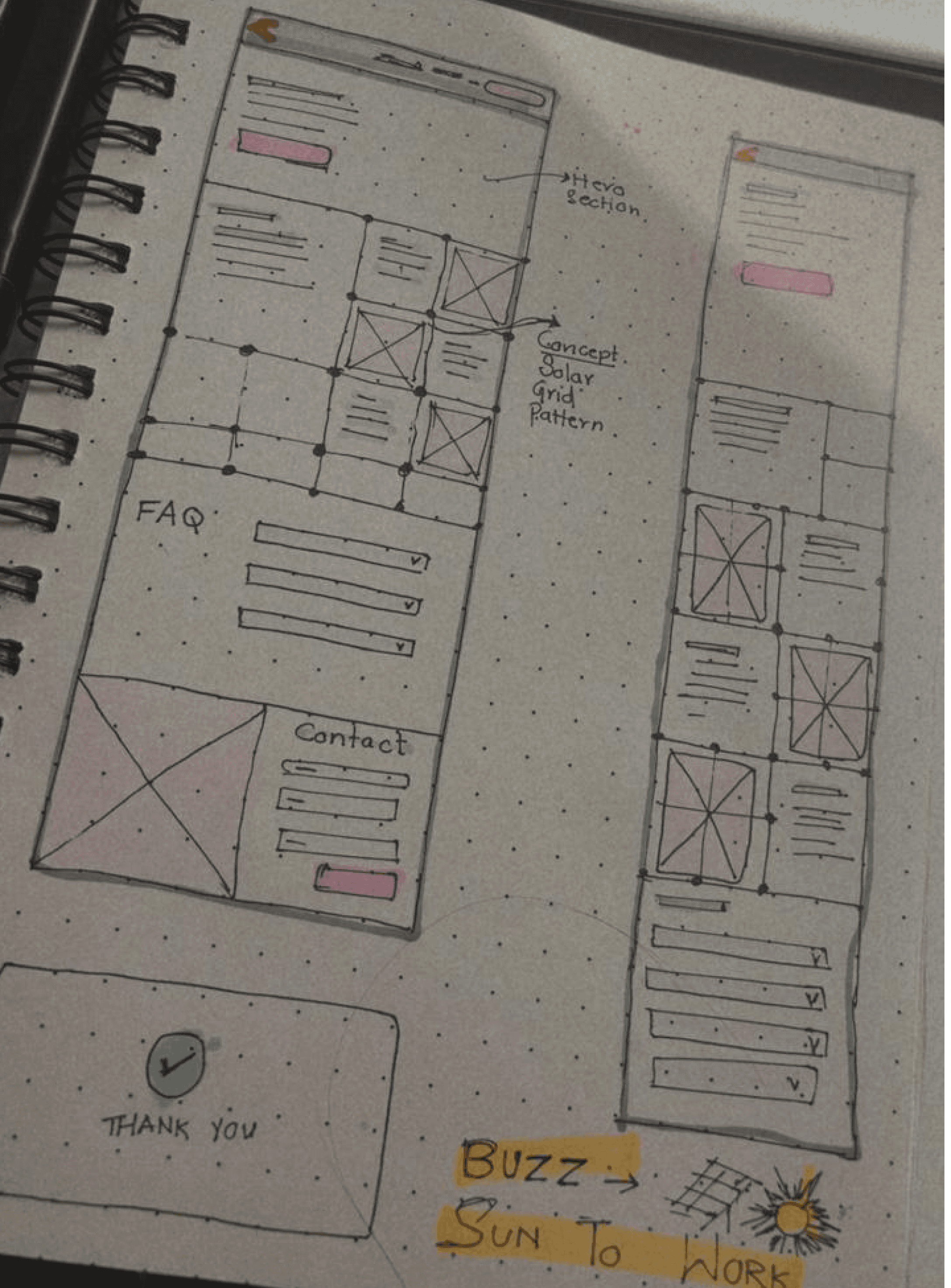
Since the primary goal of this Energy Trading Platform landing page is lead generation, I strategically placed contact form fields at both the top and bottom of the page, with a CTA form button also in the middle to maximize visibility.
To align with the solar energy theme, I designed the layout using a grid concept, visually echoing the structure of solar panels while maintaining a clean and functional design.
Lead generation form


I researched popular brands that use red in their logos and websites to understand how the color influences CTA button design and user engagement.




Problem – Full form at the top made users think it was the final step, reducing scroll depth.
Solution – Replaced it with 3 action buttons that trigger a pop-up form.
Impact – Improved user flow, kept the page engaging, and still captured leads effectively.
Less-scroll layout to avoid overwhelming users.
Each product paired with a clear clickable button and supporting image.
Users engage only with products they are interested in, not forced to scroll through the whole page.
Delivers all products in a single eye-shot, ensuring clarity and quick understanding.
Maintains a user-driven experience while boosting product discoverability.
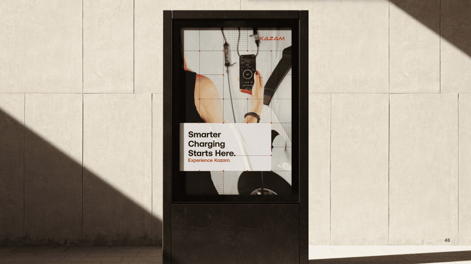
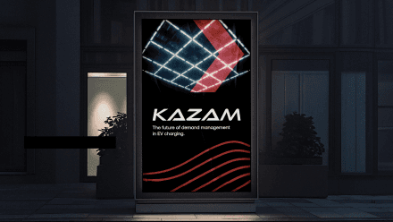
The Kazam marketing campaign was needed to build brand awareness and showcase its products effectively. It also aimed to generate leads through clear CTAs and a user-friendly layout.









Research
User research, journey mapping, competitor analysis.
Define Structure
Information architecture, sitemap, page flow.
Sketch & Wireframe
Low-fi sketches, feedback, iterations.
Prototype & Test
Clickable prototypes, A/B testing, refinements.
Visual Design
Design system, high-fi mockups, collaboration.
Handoff to Developer
Specs, assets, interaction notes for development.
Understand
Define problems, users, goals, and scope.


ZAP PRO
Hardware products
Kazam marketing campaign
Kazam
Website Redesign
My Role
UX UI | User research | Visual design | Design System
Team
Serena - Product Designer | Product Management Team | Marketing Team
Timeline
June 2025 - On going.............
Project Overview
Redesigned Kazam’s website to improve user experience, mobile accessibility, and brand perception, making EV charging solutions easier to discover.
Work in progress ......
Problem Identified
1
Outdated UI
The design feels dated and doesn’t showcase Kazam’s growth.
2
Weak CTAs
businesses that manage and monetize charging infrastructure.
3
Information Gaps
Users struggle to access clear and structured information.
4
Incomplete Pages
Many product and solution pages are left blank or not designed.
Design Progress
Kazam is an EV charging infrastructure and software company that provides both hardware and software solutions for CPOs, fleet operators, businesses, and EV drivers making charging more accessible, affordable, and scalable.
Research
User research, journey mapping, competitor analysis.
Understand
Define problems, users, goals, and scope.
Define Structure
Information architecture, sitemap, page flow.
Sketch & Wireframe
Low-fi sketches, feedback, iterations.
Prototype & Test
Clickable prototypes, A/B testing, refinements.
Visual Design
Design system, high-fi mockups, collaboration.
Handoff to Developer
Specs, assets, interaction notes for development.
Kazam Brand identity



My collaborators
1
Product Manager
Coordinated with product managers to align design goals with business objectives.
2
Graphic Design
Collaborated with graphic designers to create visually engaging assets aligned with the brand.
3
Marketing Team
Teamed up with marketing to ensure designs supported campaigns and brand storytelling.
4
Sales Team
Supported the sales team with design solutions that enhanced client engagement and communication.
5
Developer Team
Partnered with developers to transform designs into seamless, functional products.
CTA Color Research
I researched popular brands that use red in their logos and websites to understand how the color influences CTA button design and user engagement.





Analyzing User Behavior
1
Google Analytics
Tracks traffic, user flows, and page performance.
Identifies drop-offs and measures redesign impact
2
Hotjar
Heatmaps & session recordings reveal clicks, scrolls, and drop-offs.
Highlights pain points to guide redesign priorities.
Mobile view
Concept
Energy Trading Platform
Since the primary goal of this Energy Trading Platform landing page is lead generation, I strategically placed contact form fields at both the top and bottom of the page, with a CTA form button also in the middle to maximize visibility.


To align with the solar energy theme, I designed the layout using a grid concept, visually echoing the structure of solar panels while maintaining a clean and functional design.
Problem – Full form at the top made users think it was the final step, reducing scroll depth.
Solution – Replaced it with 3 action buttons that trigger a pop-up form.
Impact – Improved user flow, kept the page engaging, and still captured leads effectively.

Kazam marketing campaign
The Kazam marketing campaign was needed to build brand awareness and showcase its products effectively. It also aimed to generate leads through clear CTAs and a user-friendly layout.
Challenges
Less-scroll layout to avoid overwhelming users.
Each product paired with a clear clickable button and supporting image.
Users engage only with products they are interested in, not forced to scroll through the whole page.
Delivers all products in a single eye-shot, ensuring clarity and quick understanding.
Maintains a user-driven experience while boosting product discoverability.
ZAP PRO
Hardware products


Kazam is an EV charging infrastructure and software company that provides both hardware and software solutions for CPOs, fleet operators, businesses, and EV drivers making charging more accessible, affordable, and scalable.
GET IN TOUCH
Kazam
Kazam
Website Redesign
My Role
UX UI | User research | Visual design | Design System
Team
Serena - Product Designer | Product Management Team | Marketing Team
Timeline
June 2025 - On going.............
Project Overview
Redesigned Kazam’s website to improve user experience, mobile accessibility, and brand perception, making EV charging solutions easier to discover.
Work in progress ......
Problem Identified
1
Outdated UI
The design feels dated and doesn’t showcase Kazam’s growth.
2
Weak CTAs
businesses that manage and monetize charging infrastructure.
3
Information Gaps
Users struggle to access clear and structured information.
4
Incomplete Pages
Many product and solution pages are left blank or not designed.
Design Progress
Research
User research, journey mapping, competitor analysis.
Understand
Define problems, users, goals, and scope.
Define Structure
Information architecture, sitemap, page flow.
Sketch & Wireframe
Low-fi sketches, feedback, iterations.
Prototype & Test
Clickable prototypes, A/B testing, refinements.
Visual Design
Design system, high-fi mockups, collaboration.
Handoff to Developer
Specs, assets, interaction notes for development.
Kazam Brand identity
My collaborators
1
Product Manager
Coordinated with product managers to align design goals with business objectives.
2
Graphic Design
Collaborated with graphic designers to create visually engaging assets aligned with the brand.
3
Marketing Team
Teamed up with marketing to ensure designs supported campaigns and brand storytelling.
4
Sales Team
Supported the sales team with design solutions that enhanced client engagement and communication.
5
Developer Team
Partnered with developers to transform designs into seamless, functional products.
CTA Color Research
I researched popular brands that use red in their logos and websites to understand how the color influences CTA button design and user engagement.
Analyzing User Behavior
1
Google Analytics
Tracks traffic, user flows, and page performance.
Identifies drop-offs and measures redesign impact
2
Hotjar
Heatmaps & session recordings reveal clicks, scrolls, and drop-offs.
Highlights pain points to guide redesign priorities.
Energy Trading Platform
Since the primary goal of this Energy Trading Platform landing page is lead generation, I strategically placed contact form fields at both the top and bottom of the page, with a CTA form button also in the middle to maximize visibility.
Concept
To align with the solar energy theme, I designed the layout using a grid concept, visually echoing the structure of solar panels while maintaining a clean and functional design.
Mobile view
Problem – Full form at the top made users think it was the final step, reducing scroll depth.
Solution – Replaced it with 3 action buttons that trigger a pop-up form.
Impact – Improved user flow, kept the page engaging, and still captured leads effectively.
Kazam marketing campaign
The Kazam marketing campaign was needed to build brand awareness and showcase its products effectively. It also aimed to generate leads through clear CTAs and a user-friendly layout.
Challenges
Less-scroll layout to avoid overwhelming users.
Each product paired with a clear clickable button and supporting image.
Users engage only with products they are interested in, not forced to scroll through the whole page.
Delivers all products in a single eye-shot, ensuring clarity and quick understanding.
Maintains a user-driven experience while boosting product discoverability.
ZAP PRO
Hardware products